I am very much enjoying the range on that Broadsword
UI for two-handed weapons
-
cactusanctuary
- Posts: 2
- Joined: Sun Feb 01, 2015 1:45 pm
UI for two-handed weapons
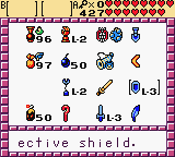
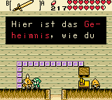
For two-handed weapons, it feels sort of redundant to have the UI in the top-right show the same weapon for both buttons. It could be nicer to have the UI change a little bit so both button icons are touching the weapon icon.
I am very much enjoying the range on that Broadsword
I am very much enjoying the range on that Broadsword
Re: UI for two-handed weapons
Yeah, maybe something like this:

and


and


